Custom Curves and Properties Of Curves in INOSIM Gantt
In your model, the same raw material is stored in several tanks, and you wish to keep track of the whole stock by using filling level curves in the Gantt chart? The throughput of a continuously driven reactor is varied between 50 and 100%, and you wish to display the course of these values by a curve in the Gantt chart?
With Custom Curves you can display any series of values as curves in the Gantt chart.
To create a Custom Curve, go to the menu Model and click on Curves to open the curve dialog. Click on the New Item button to create a new CustomCurve.
Alternatively, in the INOSIM database window, navigate to Equipment > Curves > Custom, and chose New Curve from the context menu and rename your curve. Via VBA control, a value with an automatic determined timestamp can be assigned to that curve. As code example:
CustomCurves("CurveName").AppendValue(123)Complete stock as Custom Curve
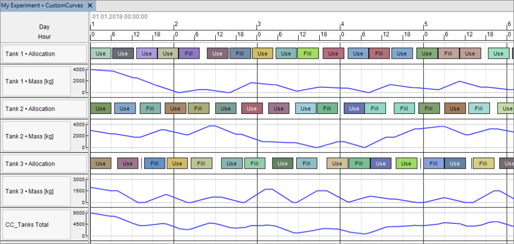
In the example project, at every start and end of a transfer, the filling levels of all tanks are totaled. This value is temporarily stored in a CustomAttribute and then assigned to a curve:
CustomCurves("CC_Tanks Total").AppendValue(ActiveExperiment.CustomAttributes("Tanks Total"))In the bottom row (CC_Tanks Total) of the Gantt chart, you can see the resulting curve, which shows the sum of the filling levels of tanks 1 to 3:
Highlighting critical values
With the curves properties, additional settings can be defined. If for example for a raw material a stock of less than 2000 kg is critical, the according parts of the curves can be highlighted in color by assigning the parameter LowValue. In the example, areas of the curve with values > 5000 are highlighted by orange color.
The result looks like this:

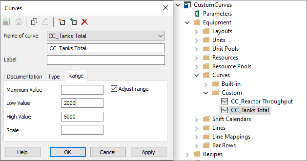
A Maximum Value can be specified: values bigger than this threshold are not shown in the graph but the time points are highlighted in red.
In the following example, we specified a Maximum Value of 6000:
The result looks like this:

Scaling the graph
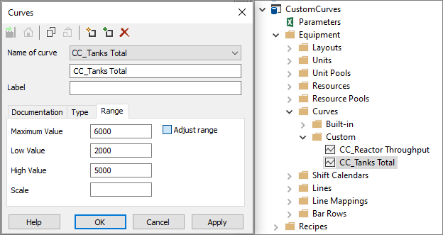
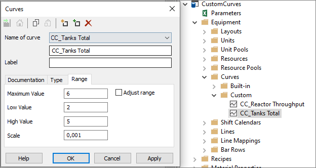
By specifying the Scale, you can scale the vertical axis. In the example, we want the curve to show the values in tons instead of kilograms, so a scale of 0.001 is defined. Please note that the other parameters have to be adjusted accordingly, hence the Low Value is now 2 [t] instead 2000 [kg].
The result looks like this:

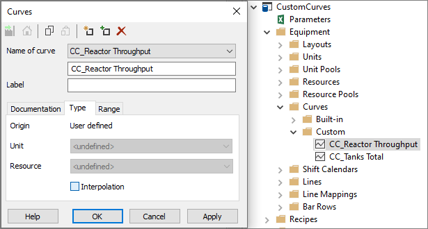
Interpolation
By default, the curve is interpolated linearly between two values. For the variable throughput of a reactor which is specified daily and is constant for 24 h, this representation is not useful.
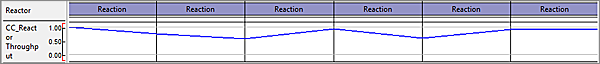
Therefore, the interpolation can be disabled on tab Type:
The result looks like this:
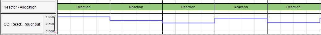
Alternatively, the value could be assigned to the curve at the beginning and at the end of the period of constant throughput.
- Example Project
- PDF printout of this Tip & Trick
More Questions?
Want to know more about this topic or have another question? Please contact us!
More Tips & Tricks
Custom Bars
Custom Bars Custom bars are a new feature introduced in INOSIM 12. They allow you to display processes in your Gantt chart which are not…
Printing Complex Gantt Charts As PDFs
In this tip, you learn how to create PDFs which display a selected time range of a complex Gantt chart. You also learn how to…
Benefit from your Excel VBA Know-how
Benefit from your Excel VBA Know-how In this tip and trick we want to show you how to activate and use Excel’s VBA commands from…